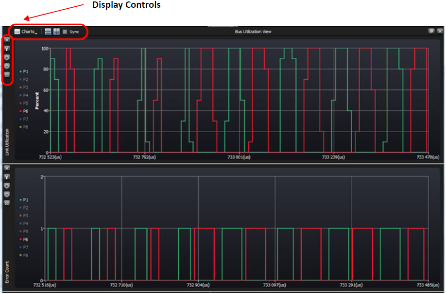
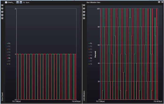
Bus Utilization View displays both a Link Utilization and an Error Count over a specific time frame.
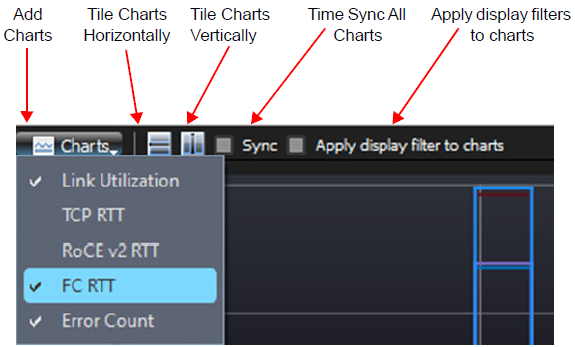
Bus Utilization Controls
-
Add Charts: Display Error Count or Link Utilization or both
-
Tile Vertical: Display windows vertically
-
Tile Horizontal: Display windows side-by-side
-
Synchronize Charts: Time frame is the same for both views
-
Delete Chart Setting: Delete display Error Count or Link Utilization or both
-
Zoom In: (Ctrl + mouse wheel
-
Zoom Out: Ctrl + mouse wheel
-
Fit to Screen: Full view of Trace
-
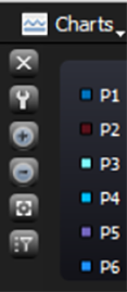
Show or Hide Ports: Show/Hide Port1 – Port8
|
Tools |
|
Ports |
|---|---|---|
|
Charts View Close Adjust Settings Zoom In Zoom Out Fit to Screen Select/Deselect all |
|
Show/Hide Ports by number
|
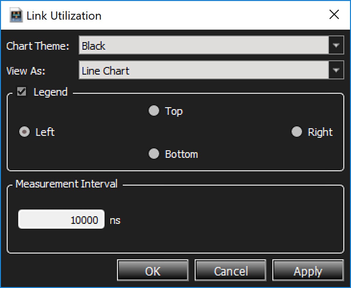
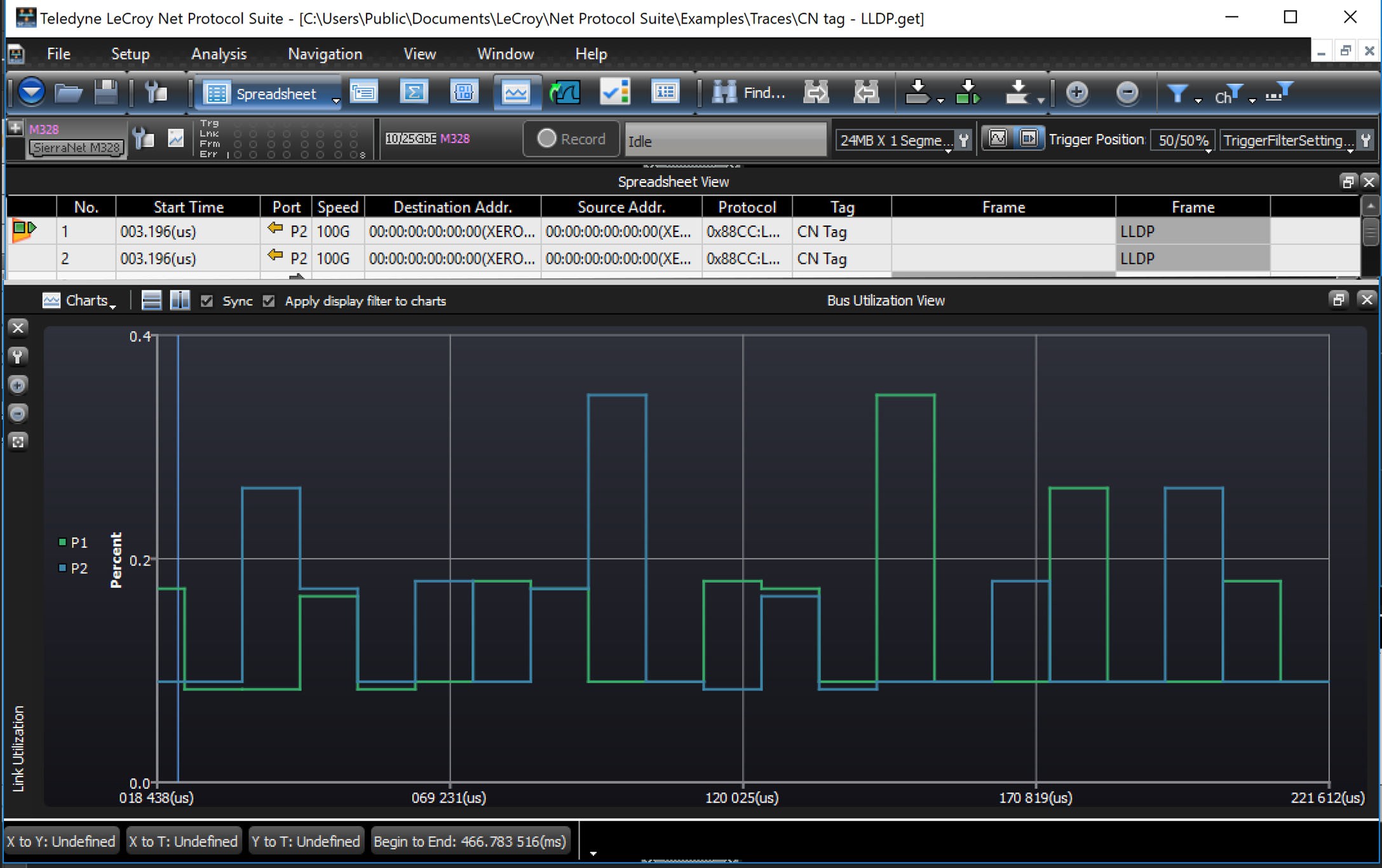
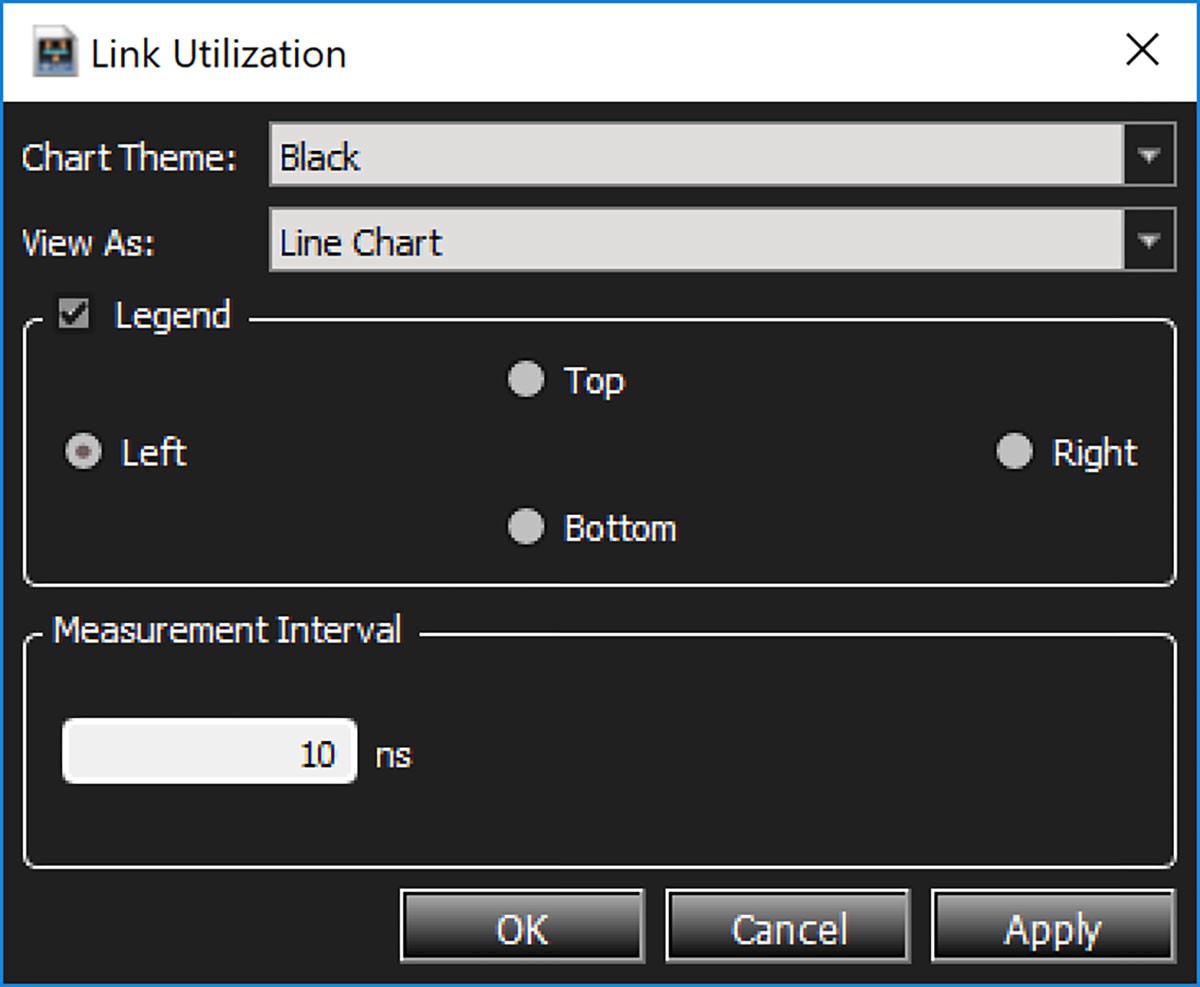
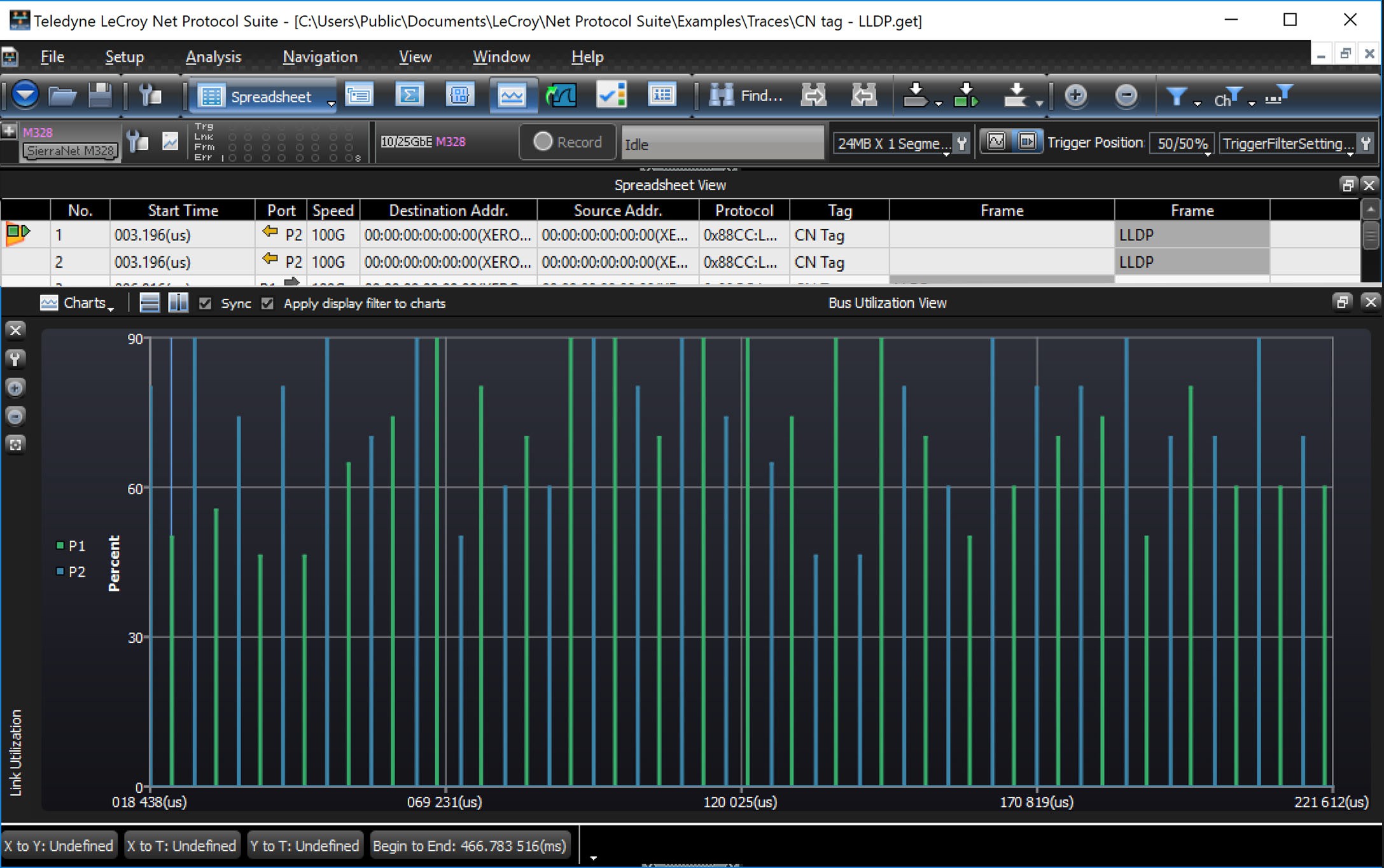
Note: Measurement Interval: The Measurement Interval parameter defines a sampling period for calculating graph data points. During each time interval, the graph will average all values within that interval and generate one data point for the graph.
-
Larger intervals will result in fewer data points, and thus less-precise graphs.
-
Smaller intervals will result in more data points, and thus more-precise graphs.
-
Graphs, such as Link Utilization, are usually best-served by larger intervals of >100ms.
-
The RTT graph requires high precision and is best served by a minimum interval of 1ns.
Tile Horizontally
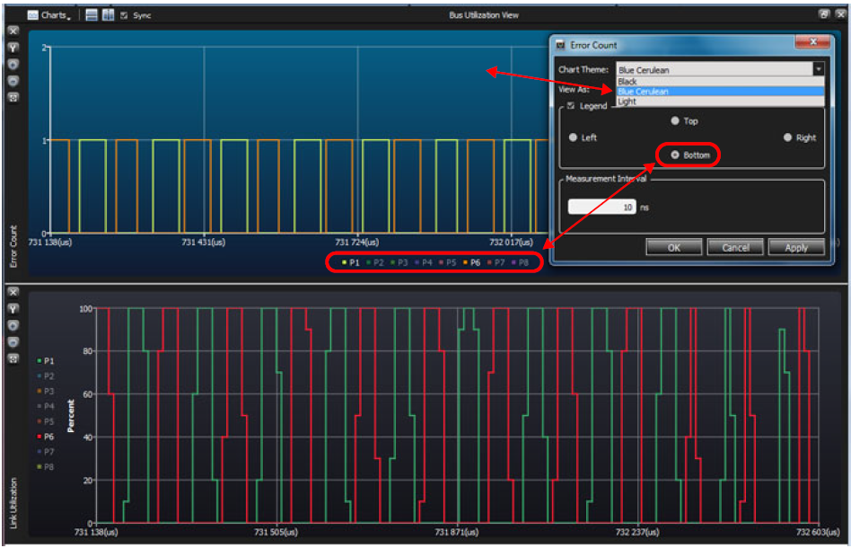
Adjust Settings
You can Adjust Settings of the Display window. In this case the background color is Blue and the Port Numbers are listed below the Display.
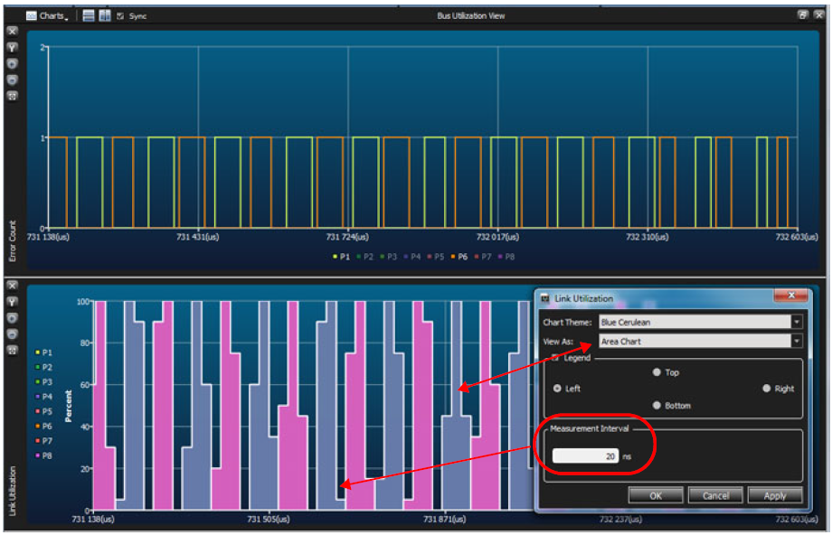
You can also change from a line chart to an Area chart and change the Measurement Interval.
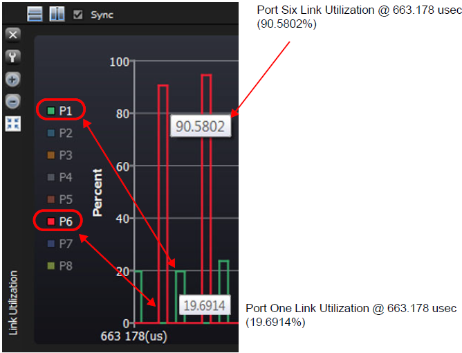
Rolling Cursor Over Point in Display
To find out information about a specific point in the display, roll your cursor over the point of interest and its value will be displayed.
Zoom In Using Cursor
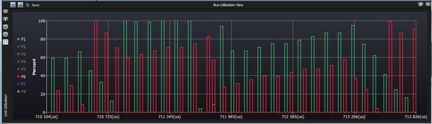
Another way to use the Zoom function is to move your cursor into the display panel, hold down the left mouse button and drag it over a section of the display. When you release the mouse the highlighted section will be displayed over the entire width of the display.
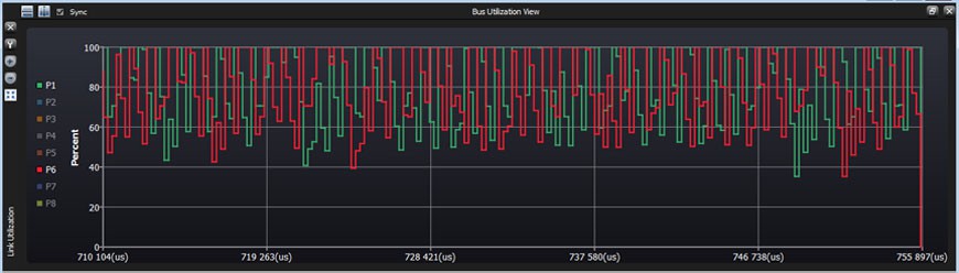
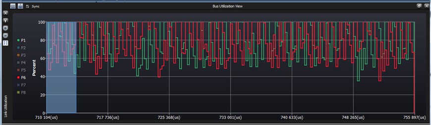
Highlighted area only displayed below.
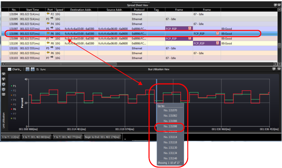
Display Bus Utilization and Spreadsheet Views
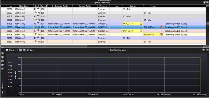
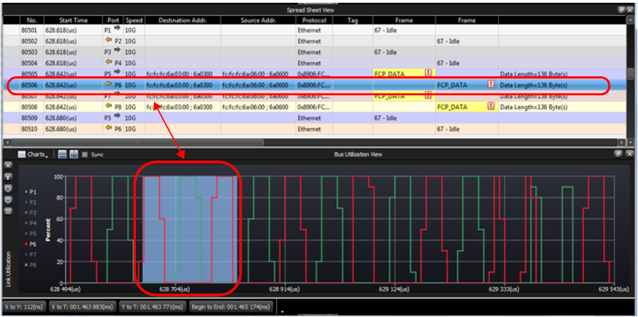
If you open the Spreadsheet View and the Bus Utilization View, clicking on an item in the Spreadsheet View will highlight that item in the Bus Utilization Charts. Initially, you’ll see the entire Trace in the Bus Utilization View.
Quick Navigation
One other way that the Spreadsheet View and Bus Utilization View work together, is that if you have zoomed in enough to see individual events, you can click the left mouse button on an edge to view the Item Number(s) that contribute to the Utilization number in the graph.